


 Websites have really become smart and wrong or inappropriate styling can make our page contents clutter and as such It’s always a different task preparing your page to accept varying viewports, broadly categorized into Desktop, iPad and Mobile. we want our website to still maintain beauty and the contents to adjust to those widths in a responsive way. With pure css this is very much achievable but boostrap grid layout makes it just easy for any beginner to decide how they want their website to look like on gadgets with varying width. This gives your page a good layout and eases the work to be done during fine tuning with css media queries.
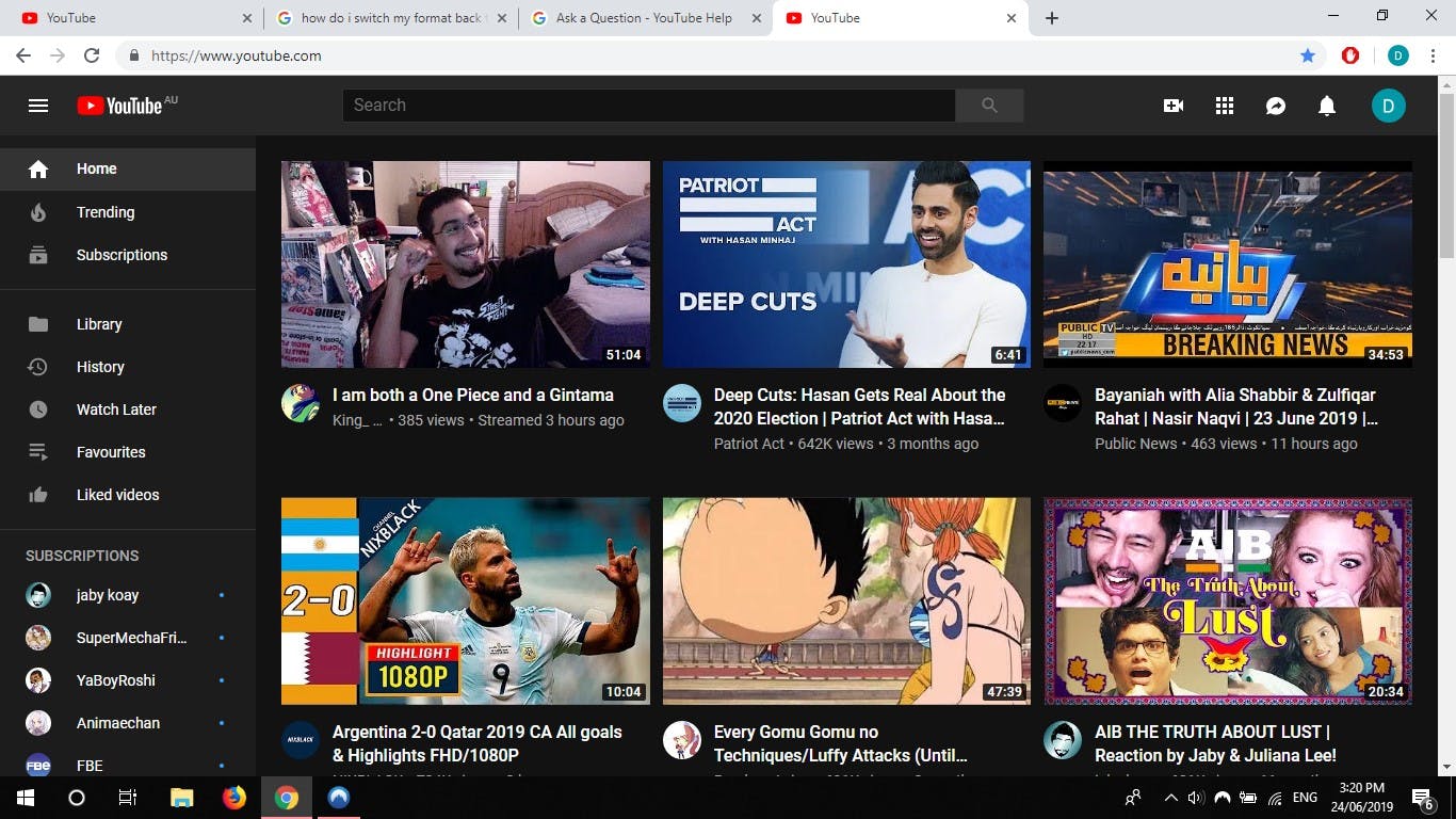
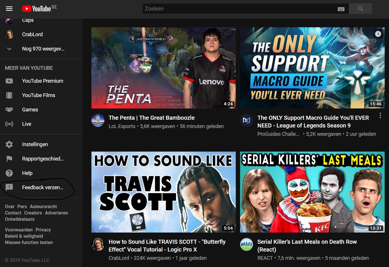
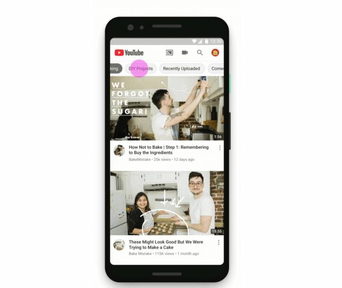
Now Bootstrap grid layout! Bootstrap is a css framework with libraries that contain already styled components. Pretty wow right? Taking the Youtube website homepage as an example we discover three equally sized video recommendations stacked one above another, but then when we try to resize the page to a smaller viewport(width) the images rearrange to two columns and subsequent reduction would leave us with a single column with video recommendations stacked above themselves. The varying widths can be compared to desktop, iPad and mobile phone screens and in our sample project we’ll try to mimic this responsivity.
Websites have really become smart and wrong or inappropriate styling can make our page contents clutter and as such It’s always a different task preparing your page to accept varying viewports, broadly categorized into Desktop, iPad and Mobile. we want our website to still maintain beauty and the contents to adjust to those widths in a responsive way. With pure css this is very much achievable but boostrap grid layout makes it just easy for any beginner to decide how they want their website to look like on gadgets with varying width. This gives your page a good layout and eases the work to be done during fine tuning with css media queries.
Now Bootstrap grid layout! Bootstrap is a css framework with libraries that contain already styled components. Pretty wow right? Taking the Youtube website homepage as an example we discover three equally sized video recommendations stacked one above another, but then when we try to resize the page to a smaller viewport(width) the images rearrange to two columns and subsequent reduction would leave us with a single column with video recommendations stacked above themselves. The varying widths can be compared to desktop, iPad and mobile phone screens and in our sample project we’ll try to mimic this responsivity.
How Bootstrap Grid layer works.
 The page layout is divided by twelve(12) columns which means we can only have a maximum of 12 columns per row. Taking the Youtube homepage as an example say we want to display 12 recommended videos which is the maximum, we create a div with class="col-lg-1". In this case, lg means large screen, the unit 1 means we're assigning each image to 1 unit of the available 12 and since each image takes 1 unit we'll have 12 videos filling up the entire page.
Further explanation on lg,md,sm.
- col-lg: takes care of the laptop and desktop sizes i.e large
- col-md: signifies medium and is in charge of ipad width
- col-sm: it's in charge of rendering the page to ensure responsivity in mobile phones, "sm" depicts small.
<div class="row">
    <div class="new-div col-lg-4 col-md-6 col-sm-12" style="background-color: teal; border: 1px
 solid">
             First Youtube Video
        </div>
<div class=" new-div col-lg-4 col-md-6 col-sm-12" style="background-color: pink; border: 1px solid">
             Second Youtube Video
        </div>
        <div class=" new-div col-lg-4 col-md-6 col-sm-12" style="background-color: red; border: 1px solid">
             Third Youtube Video
        </div>
        <div class="new-div col-lg-4 col-md-6 col-sm-12" style="background-color: teal; border: 1px
 solid">
             Fourth Youtube Video
        </div>
<div class=" new-div col-lg-4 col-md-6 col-sm-12" style="background-color: pink; border: 1px solid">
             Fifth Youtube Video
        </div>
        <div class=" new-div col-lg-4 col-md-6 col-sm-12" style="background-color: red; border: 1px solid">
             Sixth Youtube Video
        </div>
</div>
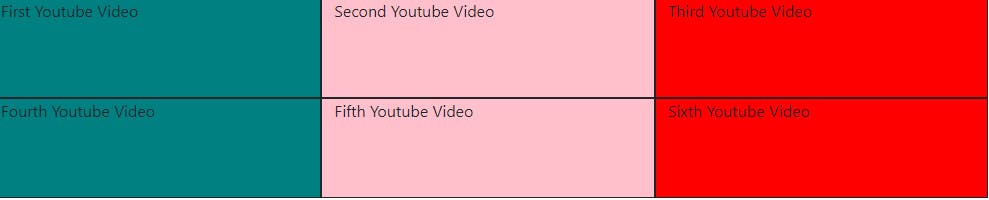 The first div tells the browser to display a video that occupies 4 units of the overall 12 i.e 1/3 of the entire row at desktop viewport, the second div tells the browser to occupy another 4 units yielding 8 i.e 2/3 of the desktop and the third div tells the browser to display the last video i.e the 12th unit (3/3) of the desktop width. By this we can see the three videos stacked side by side to fill up the row.
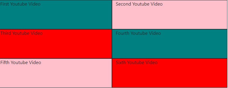 The col-md-6 above tells the browser to display 6 units of the entire viewport on medium devices like ipad (i.e 1/2) of the page, the second col-md-6 does same for the second row and the third col for the third row.
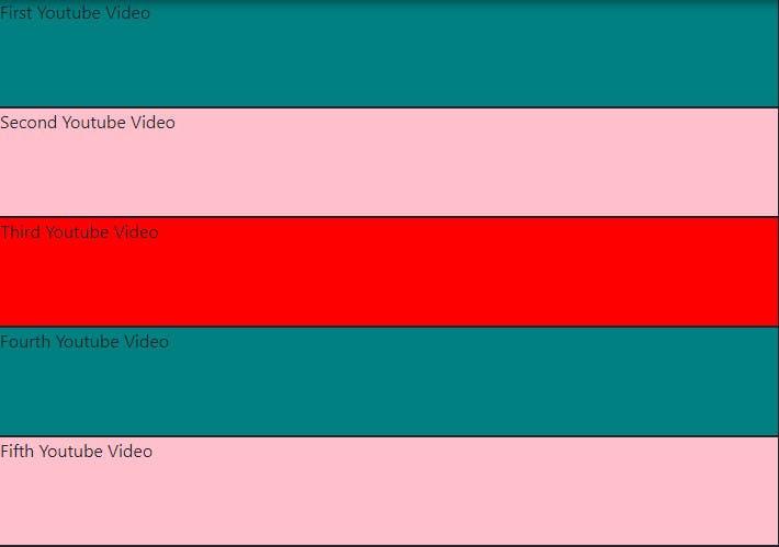 Lastly the div (col-sm-12) tells the browser to display 12/12 (1 unit) on small screen sizes as seen above.
Practice more with:
getbootstrap.com/docs/5.0/layout/grid
..In theory there is no difference between theory and practice, but in practice there is.